Civilization VII: UI Issues Debunked?
Author: Stella
Mar 13,2025


Civilization VII's Deluxe Edition launched just a day ago, and online discussions are already buzzing about its user interface (UI) and other shortcomings. But is the criticism justified? Let's delve into the game's UI elements and assess whether the internet's assessment is accurate.
← Return to Sid Meier's Civilization VII main article
With only Deluxe and Founder's Edition players having access to Civ VII for a day, the game is already facing criticism, primarily concerning its UI and missing quality-of-life features. While it's easy to join the chorus of complaints, let's objectively evaluate whether the UI truly deserves the harsh judgment. The best approach? A piece-by-piece analysis to determine if it meets the standards of a good, or at least functional, 4X interface.
Defining an objectively "good" 4X UI is complex. A game's context, style, and goals influence UI design, making universal rules inapplicable. However, visual design principles highlight common elements found in successful 4X UIs. Let's use these principles to evaluate Civ VII's UI.
A clear information hierarchy prioritizes accessibility and importance. Frequently used resources and mechanics should be prominent, while less critical features remain easily accessible. A good UI doesn't display everything at once; it organizes information logically.
Against the Storm offers a strong example. Building info pop-up menus are tabbed, prioritizing common actions (worker assignment, production) in the default tab. Less frequent actions (inventory, deliveries) are in subsequent tabs, with niche late-game mechanics in a final tab.
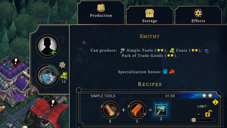
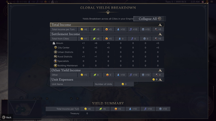
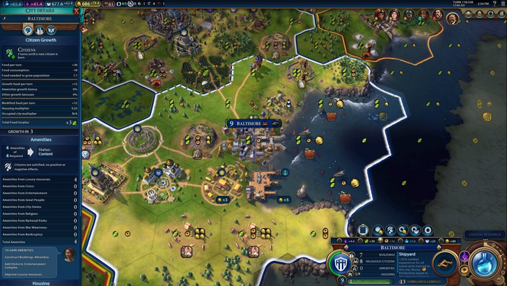
Civ VII's resource summary displays resource allocation, separating income, yields, and expenses via dropdowns. The table format is efficient, and the menu collapses easily. However, it lacks specificity. While total resource yields from Rural Districts are shown, the specific district or hex isn't identified. Expense breakdowns are also limited. While functional, greater detail would improve it.
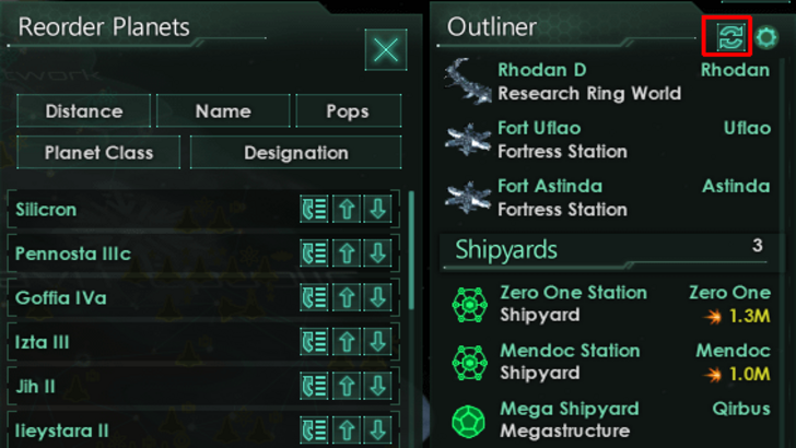
Effective visual indicators use icons and graphics to convey information quickly, reducing reliance on text. Stellaris' Outliner, despite overall UI criticism, effectively uses icons to show ship status (transit, scanning, etc.) and colony needs.
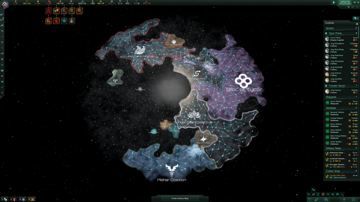
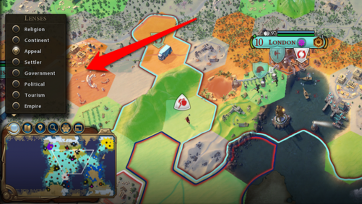
Civ VII uses iconography and numbers for resources, but includes effective visual indicators. The tile yield overlay, settlement overlay (color-coded hex viability), and settlement expansion screen (rural/urban/unsuitable tiles) are examples. However, the absence of certain Civ VI lenses (appeal, tourism, loyalty) and customizable map pins are significant criticisms. While not terrible, improvement is needed.
As complexity increases, search, filtering, and sorting become crucial. Search bars, visual filters, and sort buttons streamline navigation. Civ VI's search function excels, allowing searches for resources, units, etc., with highlighting and location snapping. Its Civilopedia links seamlessly to in-game elements.
Civ VII lacks this search function, a major drawback. Given the game's scale, this absence significantly impacts usability. Adding a search function, along with enhanced Civilopedia functionality, is crucial.
UI aesthetics and cohesiveness are vital. Civ VI's dynamic, cartographical style blends seamlessly with its overall aesthetic, reinforcing its identity.
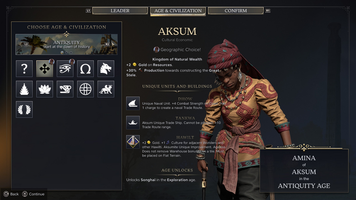
Civ VII adopts a minimalist, sleek design, using black and gold. While not cheap-looking, its less visually striking approach and subtle thematic direction have resulted in mixed reactions. Visual design is subjective, but the lack of immediate clarity is a point of contention.
Civ VII's UI, while not the best, doesn't deserve the extreme criticism. Missing features, particularly the search function, are significant but not game-breaking. Compared to other issues, UI shortcomings seem minor. While it pales against more visually impressive 4X UIs, it possesses strengths. With updates and player feedback, it can improve significantly. The current state is not as bad as widely perceived.
← Return to Sid Meier's Civilization VII main article


![NULL [Remastered]](https://imgs.39man.com/uploads/71/1719651062667fcaf6c483b.png)